The rise of mobile ecommerce has been nothing short of spectacular.
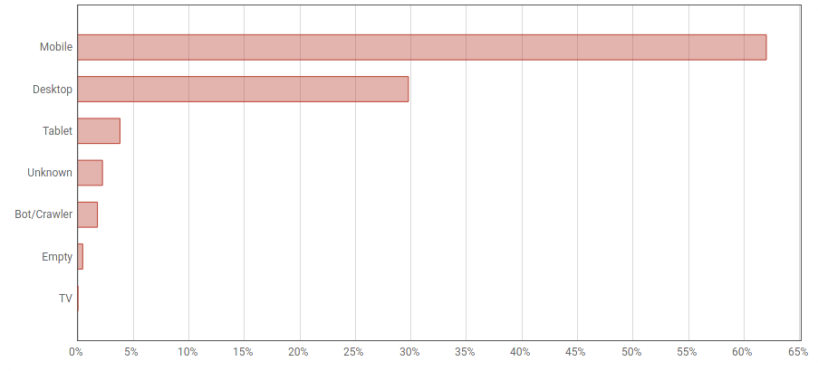
Annual mobile ecommerce sales are expected to exceed 3.5bn USD in 2021, while a recent Findify study shows shoppers using a mobile device accounted for more than 60% of all traffic to ecommerce websites.
Considering how popular mobile ecommerce has proven to be, it is increasingly important for merchants to put a lot of thought and effort into how their site appears and functions on mobile devices.
With that in mind, the experts at Findify have put together a list of their top tips on how to optimize your ecommerce site for mobile – starting with the hugely important autocomplete function.
The Autocomplete Function: How important is it?
When implemented correctly, a good autocomplete functionality serves to assist and guide users toward better search queries.
According to experts from the Baymard Institute, when autocomplete queries are done well “they inspire users about the types of queries to use, teach them correct domain terminology, help them avoid typos, and assist them in selecting the right scope to search within”.
On mobile specifically, autocomplete query suggestions are also helpful in reducing typing during query formulation.
Extensive research carried out by the Baymard Institute on 409 test subjects over the course of two years reveals users struggle with typing on mobile more than they do on desktop. Thus, any shortcut that autocomplete query suggestions can provide offers users a way to avoid struggling with the mobile keyboard and potentially introducing typos.
In testing conducted during the aforementioned research, carried out by Baymard, 78% of subjects using mobile ecommerce utilized autocomplete query suggestions, which spared them from typing an average of 8 additional characters on their small mobile keypads.
Autocomplete Design: No more than 8 suggestions on mobile
As you can imagine, a poorly designed autocomplete interface makes it extremely difficult for users to understand the options available within the function, and can either overwhelm the consumer or lead to unexpected, and potentially undesirable, interactions.
The first rule of thumb when designing your autocomplete is this: ensure the generated list of suggestions is a manageable one. The number of options should be limited so as not to overflow the user’s viewport. While this rule stems from an ease-of-use reasoning, there is also a secondary problem caused by a long list of suggestions – choice paralysis.
Findify experts recommend, and researchers from the Baymard Institute agree, that autocomplete suggestions should be limited to a max of 10 on desktop and 8 on mobile. There should be at least 4 suggestions on both devices.

Findify client BH Cosmetics providing eight suggestions in their autocomplete
Autocomplete Design: Minimize distractions
When designing your autocomplete, on both mobile and desktop, you also need to think about how the overall page will look to the shopper – including the area outside the autocomplete box.
It’s important not to distract the consumer when they have already initiated a search and have started to engage with the autocomplete function. One simple tweak can ensure this: darkening the page background while autocomplete is active.
This gives the autocomplete a stronger emphasis, minimizing elements like ads, carousels, and other page content, that could interfere with the search process.
Adding a subtle border around the autocomplete function can create even more depth and make it easier for the user to focus on the suggestions offered.
Autocomplete Design: Highlight the differences between query and suggestion
Another best practice when designing your site’s autocomplete is endeavoring to stylistically highlight the difference between words that match the search query and words that are autocomplete suggestions.
There are two ways of doing this – either you highlight the characters already typed, or you highlight the suggestions being made by the autocomplete.
While both types of unique styling can reduce the visual burden for users, highlighting the query characters helps the user gloss over repeated words, giving them less to read.
In the latter alternative, it is the prediction that is emphasized, which helps draw attention to the different suggestions, allowing the user to ignore the characters they have already typed.
Both methods are effective ways of differentiating between the query and the suggestion, thereby speeding up the process for the user and helping them make their next decision quicker and easier.

Findify client Draper James highlighting queries in their autocomplete
Autocomplete Design: Ensure users can easily read and click suggestions
The final point relating to autocomplete design is a seemingly obvious one, but is an aspect many merchants accidentally overlook – readability.
The dangers of poor readability (and clickability) in a mobile autocomplete function is best highlighted by a recent study carried out by the Baymard Institute.
“During mobile testing, autocomplete suggestions styled in small font sizes made it difficult for subjects to view and select a suggestion. Further, when inadequate spacing and small font sizes were combined, it contributed to mistaps that left some subjects puzzled upon arrival to unexpected results pages,” they wrote.
To resolve readability issues within autocomplete, use legible font sizing, ensure suitable spacing between tappable elements, and provide hit areas of an appropriate size. Finally, presenting autocomplete suggestions in lower case or title case (or “headline-style”) makes for easier readability than all uppercase text.
Autocomplete Results: Include spelling tolerance
Now that you know what design elements to incorporate in your autocomplete function, you should be thinking about the suggestions themselves and how they are presented to your valued customer.
One of the most useful capabilities you can infuse into this process is that of spelling tolerance. Your customers are only human, and when on mobile they’re also struggling with a small screen size. Mistakes will happen. Therefore, your autocomplete really needs to be able to deal with the typos it will inevitably be faced with.
Since autocomplete plays such a key role in early search interactions, unexpected suggestions due to minor typos can cause users to change their product-finding strategies by seeking other browsing methods or reworking queries, and, in the worst cases, contribute to abandonment downstream if alternate product-finding strategies don’t quickly lead to relevant results.
Since spelling errors in search queries do occur with significant frequency, autocomplete’s relevance can, and should, be enhanced by mapping misspelled words to meaningful autocomplete suggestions.

Findify client Everlast using spelling tolerance in their autocomplete
Autocomplete Results: Display and update suggestions quickly
Interacting with autocomplete suggestions becomes relatively challenging for users when they’re presented with inconsistent or slow load behavior. Autocomplete suggestions should appear and update nearly instantaneously as the user types. Delays in the display of autocomplete suggestions mean that some users will never get exposure to the very guidance that such suggestions are intended to provide.
“[Improving speed] requires intensive optimization work to ensure that the search engine can produce autocomplete suggestions (ideally in under half a second, though faster is better, as the interface will feel more responsive to users), as well as focused work on lowering network latencies, and consideration and improvement of any other factors that may increase the delay between user input and autocomplete suggestions loading,” explained an expert from Baymard.
“This is especially the case for mobile sites, where slow-loading autocomplete query suggestions or interaction issues are magnified. During mobile testing, we observed some users typing so quickly that they never saw autocomplete suggestions. Others struggled with tap and hit area issues when trying to re access the search field. It’s therefore critical that autocomplete speed and load behavior is optimized for mobile sites.”
“Give shoppers the functionality they deserve, and they will convert more often”
Overall, testing has revealed most mobile users will struggle with issues that they don’t face to the same degree when browsing desktop sites. Despite this, the trend toward mobile e-commerce continues undisturbed – for most ecommerce sites, more than half of their traffic is on mobile, and some verticals have almost exclusively mobile traffic.
“As more and more ecommerce activity continues to take place on mobile, it’s more important now than ever before that the mobile user’s experience is a smooth one – from arrival on the site right through to successfully placing an order,” explained Findify’s Vsevolod Goloviznin.
“An ecommerce site’s autocomplete is a big part of that shopper journey, which is why it’s so important to perfect this capability’s design and functionality. We know that searching shoppers convert two to three times more than those who browse, so by lowering the barriers of their search journey – with rapid relevant suggestions, correcting typos and removing distractions – they will add considerably to the bottom line.”
This piece was written by experts at Findify, a leading provider of site search and personalization software, with infused learnings from the Baymard Institute. For more information on Findify’s powerful ecommerce tool, which includes solutions such as Personalized Search, Smart Collections, and Recommendations, book a demo here.